
With
colors you can set a mood, attract attention, or make a statement. You
can use color to energize, or to cool down. By selecting the right color
scheme, you can create an ambiance of elegance, warmth or tranquility,
or you can convey an image of playful youthfulness. Color can be your
most powerful design element if you learn to use it effectively.
Complementary Colors
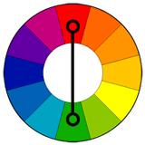 Colors that are opposite each other on the color wheel are considered to be complementary colors (example: red and green).
The
high contrast of complementary colors creates a vibrant look especially
when used at full saturation. This color scheme must be managed well so
it is not jarring.
Complementary colors are tricky to use in large doses, but work well when you want something to stand out.
Complementary colors are really bad for text.
Analogous Colors
 Analogous
color schemes use colors that are next to each other on the color
wheel. They usually match well and create serene and comfortable
designs.
Analogous
color schemes use colors that are next to each other on the color
wheel. They usually match well and create serene and comfortable
designs.
Analogous
color schemes use colors that are next to each other on the color
wheel. They usually match well and create serene and comfortable
designs.
Analogous color schemes are often found in nature and are harmonious and pleasing to the eye.
Make sure you have enough contrast when choosing an analogous color scheme.
Choose one color to dominate, a second to support. The third color is used (along with black, white or gray) as an accent.
Triad Colors
 A triadic color scheme uses colors that are evenly spaced around the color wheel.
Triadic color harmonies tend to be quite vibrant, even if you use pale or unsaturated versions of your hues.
To
use a triadic harmony successfully, the colors should be carefully
balanced - let one color dominate and use the two others for accent.
(article source: tigercolor.com; image sources: tigercolor.com, jezbel.com, blogspot.com)
Colors
affect us in numerous ways, both mentally and physically. A strong red
color has been shown to raise the blood pressure, while a blue color has
a calming effect.
Being able to use colors consciously and harmoniously can help you create spectacular results.
Here are a few examples for above color combinations.

What do you think, is this information useful? Leave your comment below.

Fashion blogger: Elle B.


Short link for this article: http://shortlink.kugati.ca/r
Comments
Post a Comment